Business Curriculum Analytics: Difference between revisions
No edit summary |
No edit summary |
||
| Line 7: | Line 7: | ||
[http://linked.aub.edu.lb/apps/charts/courses_concepts_treemap.php Curriculum Tree Map] | [http://linked.aub.edu.lb/apps/charts/courses_concepts_treemap.php Curriculum Tree Map] | ||
==Concepts Covered in Courses Table== | ==Concepts Covered in Courses Table== | ||
| Line 14: | Line 15: | ||
[http://linked.aub.edu.lb/apps/tablebrowser/table.php Table Highlighting the Concepts Covered in Courses and Topics] | [http://linked.aub.edu.lb/apps/tablebrowser/table.php Table Highlighting the Concepts Covered in Courses and Topics] | ||
==Course Concepts Overlap using Sankey Diagram== | |||
The below visualization shows how courses overlap in terms of concepts covered. The selected course appears on the left, versus the other courses in the curriculum that share concepts with the selected course. In the middle the list of common concepts is shown, with their corresponding topics on their left and right. | |||
[[File:SankeyDiagram.PNG|link=http://linked.aub.edu.lb/apps/charts/courses_concepts_sankey_intersection.php]] | |||
[http://linked.aub.edu.lb/apps/charts/courses_concepts_sankey_intersection.php Sankey Visualization Showing how Courses Overlap in their Concepts Covered] | |||
==Concepts Bar Chart== | ==Concepts Bar Chart== | ||
Revision as of 11:50, 6 January 2016
We are in the process of building various tools and visualizations to support the Business Curriculum Analytics. The tools make use of the Linked Data generated out of this Wiki. This page will be constantly updated with more tools.
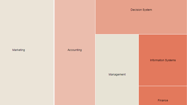
Curriculum Tree Map
The curriculum Tree Map enables you to dig into the business curriculum starting from "Subjects", down to "Courses", to "Topical Coverage", with the ability to check the concepts covered inside each topic. The size of the parts are determined by the number of concepts covered in each area. Click on the TreeMap below to go to the live data.
Concepts Covered in Courses Table
The below table highlights how concepts are covered in courses. The "X" denotes the occurrence of the concept in the course. When more than one "X" exist, the user can check where the concept is mentioned by placing the mouse pointer on the table cell. There is also a feature to click on the concept to check the original wiki page. Click on the table to go to the live data visualization.
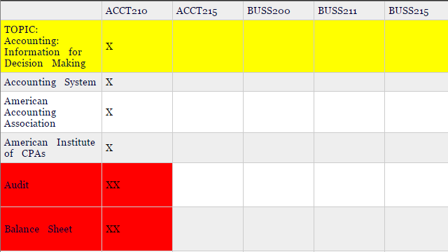
Table Highlighting the Concepts Covered in Courses and Topics
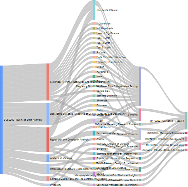
Course Concepts Overlap using Sankey Diagram
The below visualization shows how courses overlap in terms of concepts covered. The selected course appears on the left, versus the other courses in the curriculum that share concepts with the selected course. In the middle the list of common concepts is shown, with their corresponding topics on their left and right.
Sankey Visualization Showing how Courses Overlap in their Concepts Covered
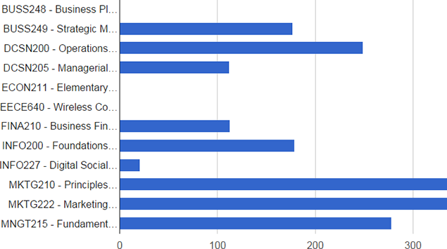
Concepts Bar Chart
The concepts Bar Chart is a visualization that highlights the number of concepts in each course. This was implemented using the Google Chart API. Click on the graph to go to the live chart.